HI all,
I would like to introduce you to my youngest boy - i couldnt resist trying to capture the toothless grin that he is famous for.
This started out ok with the line drawing and the diox purple underpainting - but now it has got to the ugly stage and i am forcing myself to work through it. His skin tones were painted using rose madder and yellow ochre. Way to yellow for him so i am going to add a layer or 2 of perm rose just to try and tone it out a bit. If there are any portrait artists out there I could really use some help trying to correct these issues.


The next installment of Xander is here. It is starting to pop, I started this session by masking out his eyes and a few highlights in his hair before i proceeded to start adding a large wash of his skin tones focusing on transitions between the yellows and reds. After a few layers to build up tone, I went back in with a very light wash of cobalt blue and started "carving out" some shadows. Still looking pretty ugly at this stage but I can see how it will all come together very soon.

Special note ** purple underpaiting is not the most suitable for infant portraits as it is very hard to neutralize. Im probably going to go alot darker then intended once all is said and done, but this is for my own personal collection so ill have to live with it. ;) This installment consisted of adding a whole lot more perm rose in the transition area where his face is just starting to turn into shadow. and a little more cobalt in the shadows to try and cool the tones a little.
.JPG)
What a difference a glaze can make. I wasnt pleased with the brightness of the purple so i went in with a bold wash of hookers green deep which greyed everything out on that side. I still have some blending to do around his chin area to try and get rid of the harsh shadow. Also I have removed the mask and i can now see wher i have to add some color to blend and soften some features. As well I have to go back in and do a whole lot of work on his eyes.

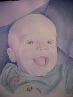
Stage 12 and ive had to improvise on his hair a little - as he has just the slightest peach fuzz on his head at this age- no eye lashes and no eye brows so in order to soften his big melon ive added a varied combination of raw sienna, burnt umber and a little violet;) . Also ive worked a bit more on adjusting his skin tones in soft thin layers of color. But the biggest difference you will notice is the start to the addition of some texture in the background. This is now starting to "sing". The masking is still on the right side and will be working on the left side in the next installment
Image size 11.5" * 11.5"
Watercolor on 140lb CP
Yeah I am finally done.. and I am happy enough with it that it is in a frame and hanging proudly on my wall. :) LOL
I would like to introduce you to my youngest boy - i couldnt resist trying to capture the toothless grin that he is famous for.
This started out ok with the line drawing and the diox purple underpainting - but now it has got to the ugly stage and i am forcing myself to work through it. His skin tones were painted using rose madder and yellow ochre. Way to yellow for him so i am going to add a layer or 2 of perm rose just to try and tone it out a bit. If there are any portrait artists out there I could really use some help trying to correct these issues.


The next installment of Xander is here. It is starting to pop, I started this session by masking out his eyes and a few highlights in his hair before i proceeded to start adding a large wash of his skin tones focusing on transitions between the yellows and reds. After a few layers to build up tone, I went back in with a very light wash of cobalt blue and started "carving out" some shadows. Still looking pretty ugly at this stage but I can see how it will all come together very soon.

Special note ** purple underpaiting is not the most suitable for infant portraits as it is very hard to neutralize. Im probably going to go alot darker then intended once all is said and done, but this is for my own personal collection so ill have to live with it. ;) This installment consisted of adding a whole lot more perm rose in the transition area where his face is just starting to turn into shadow. and a little more cobalt in the shadows to try and cool the tones a little.
.JPG)
What a difference a glaze can make. I wasnt pleased with the brightness of the purple so i went in with a bold wash of hookers green deep which greyed everything out on that side. I still have some blending to do around his chin area to try and get rid of the harsh shadow. Also I have removed the mask and i can now see wher i have to add some color to blend and soften some features. As well I have to go back in and do a whole lot of work on his eyes.

Stage 12 and ive had to improvise on his hair a little - as he has just the slightest peach fuzz on his head at this age- no eye lashes and no eye brows so in order to soften his big melon ive added a varied combination of raw sienna, burnt umber and a little violet;) . Also ive worked a bit more on adjusting his skin tones in soft thin layers of color. But the biggest difference you will notice is the start to the addition of some texture in the background. This is now starting to "sing". The masking is still on the right side and will be working on the left side in the next installment

Image size 11.5" * 11.5"
Watercolor on 140lb CP
Yeah I am finally done.. and I am happy enough with it that it is in a frame and hanging proudly on my wall. :) LOL
I think your doing great...this is the stage I usually overwork something.
ReplyDeleteCan't help much with the flesh tones, but I'll babysit!
Such a cutie!
Thanks Diana, I am working on my clown piece at the same time, so i am getting to know the glazes i need to use as i go. I am learning the hard way that using this mix can get dirty looking fast if worked to much.
ReplyDeleteps.. we could alwys use more sitters - lol
he is much sweeter in person :)