It has been a long time since I posted a demo so I will take this opportunity and share with you my latest commission. This is Maia, her wonderful husband asked me to paint this gorgeous picture of his wife as a surprise for her birthday. Awe isn't he just so sweet. I have known this couple for many years and was so honoured when asked, and in all reality who could pass up such a beautiful model. :D
Step 1: This is the third workup of the line drawing hence the 2 pieces of paper taped together, nothing fancy here. So I waited for a nice bright day taped her to the window and transferred her to my watercolor paper. The hard part is over. I think that probably my most challenging aspect of this project was the fact that I knew this lady and wanted to do her justice.
 Stage 2: Lets add color. So in this stage I masked out some key highlights, like the glints of lights from the underskirt and earring, and eyes. The other highlights, like the one on her shoulder I could work around because of the size. I don't like making fluid and try and avoid using it whenever possible. So working with just 3 colors, quin gold, perm red and cobalt blue I layed in the basic patterns of her skin. I will be going back and adding more layers as more of the painting is completed but this gives me a bases in which to judge all other values.
 Stage 3: Add some darks. I needed to add some darks to give a some sense as to where I was going. Even with just this tiny part of the painting somewhat completed it really made her come alive.
 Stage 4: Building layers. Did you notice the oops that was made when adding her skin earlier? I had to drop her tummy back down under the floating scarf because you would see a hint of her tummy through the scarf. This piece is all about layers and really made me stop and think about the process. Her skin and underskirt would show through the sheer scarf in some places and the background would come through in others.
Stage 6: Folds and fabrics. This piece offered many challenges, the main one was the fabric and the sheer scarf. I needed to find a way to delineate the underskirt from the scarf, add texture and tie in the background. Not a small task. For the scarf and dress colors I used a mix of cobalt blue, cobalt turquoise lt. (this color is slightly granulating and was the perfect choice for just a hint of texture in the scarf), and a touch of paynes grey as I knew I would be using it in the background and needed that color to show through the scarf.
Stage 7: Adding the background. Using a wet into wet technique I applied
the first background layer using paynes grey, alizarin crimson and cobalt blue.
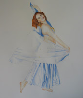
Stage 8: Final touches and done. Now it is all about adding detail and making sure your values and tones are accurate.

The finished piece is 9 * 12 on 140lb CP arches paper
Hope you enjoy :)
Step 1: This is the third workup of the line drawing hence the 2 pieces of paper taped together, nothing fancy here. So I waited for a nice bright day taped her to the window and transferred her to my watercolor paper. The hard part is over. I think that probably my most challenging aspect of this project was the fact that I knew this lady and wanted to do her justice.


Stage 7: Adding the background. Using a wet into wet technique I applied
the first background layer using paynes grey, alizarin crimson and cobalt blue.
Stage 8: Final touches and done. Now it is all about adding detail and making sure your values and tones are accurate.

The finished piece is 9 * 12 on 140lb CP arches paper
Hope you enjoy :)
Comments
Post a Comment